08 Jun Modern Home Designs for Your Short Term Rental
In recent years the ‘modern’ look has taken off around the U.S. This trend has affected more than just the residential homes, it’s gone commercial. Everything from retail stores to fast-food restaurants has implemented a more modern design aesthetic into their branding.
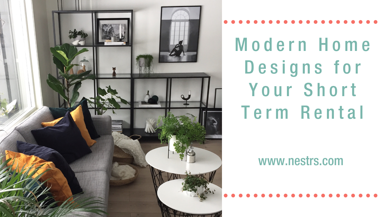
What is ‘modern’ design? We’ll call the modern design a broad category, but here are what the basics include: cleanliness, open concept, neutral tones, bright and dark contrast materials. This concept can be applied in and outside the home. Now I’m not quite sure if plants are considered part of the modern aesthetic style, but if not they are found together very often! I’ve found myself adding them to more and more properties. You can never have enough plants in my opinion 😉
What’s great about this design style is that it looks clean and typically provides multiple functions within a space. This is why it’s a great style to apply to any short term rental. Many people think that to apply a modern look to your home, your property should be newer and that just isn’t the case!
Related: Airbnb Photography Best Practices
Home types
What types of home styles are suitable for modern home design? The right answer is, any of them! Obviously you want your home or rental property to flow and appear cohesive so that plays a major role in selecting the right style for you. However, we as hosts are trying to cater to guests and the modern design is a great way to style your space.
Here are a few different homes that have applied the modern aesthetic:
Lodge (Source Link)
This lodge definitely fits the bill when it comes to emanating the modern design style. They have kept the warmth of they lodge feel by keeping the wooden exterior but separate the design by creating the clean lines throughout. My favorite distinctive characteristic might have to be the chimney. Instead of using a textured material such as river stones or brick, they kept it smooth and bold.
Farm House (Source Link)
City life is where my heart is, but this farmhouse has me believing it could convert 😉 The principal design elements of a farmhouse were kept; the deep wrap around porch, vertical siding, tin roof. What makes it modern is uniformity, open concept which is conveyed through the number of windows, and the black windows themselves.
Craftsman (Source Link)
This may be the most popular home I see on Pinterest for multiple reasons! The brick herringbone walkway is amazing, which just draws the eye to the exterior accent wall. The light to dark contrast here is stark, but they do a great job of softening it by integrating the pergola style porch.
Contemporary (Source Link)
Contemporary homes are predominantly noticed for their strong, smooth surfaces and unique use of windows. These clean lines, both inside and outside, fit the design nicely. Everything from the large rectangular patio stones to the windows creates a pattern evident throughout the home.
Ranch (Source Link)
Most typical ranch homes lack depth and that is what gives them such a bland or simplistic look. The transformation that did on this one is staggering! The two eves of the house do a great job of visually creating depth where there is none. The tin roof again for the win! The subtle lines of the roof give this home more height than a shingle roof would have.
Cottage (Source Link)
We are currently renovating our own cottage right now, so it took me a while to just stop and pick a photo for this one. There is always a balance between keeping the unique charm of the home and finding ways to accent it. The curved archway is too cute and fitting the front door to accent it was definitely the right call. All of the little details in this cottage are what do it for me. Notice the shingle pattern and how the pattern is replaced in the diamond siding. Elegant.
Interior styling
Interior styling is always a puzzle every time and that’s why I enjoy it so much! Every situation comes with its own parameters that help you start formulating a plan.
Here are some quick examples: What budget are we working with? Are we able to re-use any existing pieces of decor or furniture? Do we need to have the room function for multiple uses? Obviously, are we working under a timeline?
Below I’ve listed a few quick tips and some great examples from other Airbnb’s that have done a great job with their modern design.
Looking for interior styling ideas? Check out what Nestrs have to offer!
Play with textures
This Airbnb’s kitchen has done a great job of playing with textures. Here you’ll see a combination of glass, wood, fur, leather, metal, and greenery. While both the gold and silver metals bring out a clean, they have softened the feel of the space by adding in some wood and a fur cushion. All of this of course is given more of ‘pop’ by the black accent wall. Most people see an accent wall as the main feature of an area, but forget that it can also be used to ‘help’ accent the furniture and decor you have in that space. There are always multiple ways to achieve the same look and feel, regardless of the pieces used.
Choose a unique color palette
When styling your Airbnb you want to provide and experience. Keep in mind most people’s homes are simple and not too flashy. They don’t want to be too bold or ‘color outside the lines’ because they are going to be living there for years. However, the wouldn’t mind staying somewhere for a few days that shows them a different style of life. So don’t be afraid to be bold when choosing a color palette! Pink is hardly ever a ‘go-to’ color but is such a unique look with the plywood.
Use accents
I realize that the tip ‘use accents’ is pretty much as basic as it gets. It’s equivalent to saying, “I would decorate your house.” Usings accents is such a broad stroke because of all of the potential methods you could employ; accent walls, wall colors, artwork, furniture, windows, architecture. Accents are great ways to accentuate your house’s unique character. Be strategic with your accents. Take your time to plan a few out a few and then let your intuition make changes are your space starts to fill in.
Take advantage of light sources
You could spend a whole article talking about designing around lighting. Natural light is always great and should be utilized to its fullest, but we all don’t have the luxury of having multiple floors to ceiling windows. If you are picking light fixtures, this is another opportunity to make a statement piece in your home. Often times it easier to choose your fixtures first, before you begin picking additional decor and furniture. As many lighting options as there are, there never seem to be enough when it comes to ‘finding the right one.’
Related: Hospitality for Short Term Rentals: Everything You Need to Know
Where to find inspiration
Inspiration can be found everywhere. The two most obvious places would be Instagram and Pinterest, but it can seem like decision overload. I still enjoy being able to see things in person. As good as online eCommerce stores do at trying to give you the ‘real’ feel and details of a piece, there are so many other intangibles that are hard to capture. I use a handful of smaller boutique-style businesses for special finds that help me round out the spaces that I furnish. On the daily, it seems that I find myself driving all over Columbus and I catch myself really paying attention to the neighborhood. Each neighborhood has its own feel and I want to contribute to our community in the way I design our properties. I want it to be cohesive to an extent, but still, be able to stick out from the crowd. I want to flaunt our design chops 😉
Looking for inspiration to design your short term rental? Contact Nestrs for some ideas!
Conclusion
The modern home design is a great way to style your Airbnb if you are just starting out or looking for a refresh. Regardless of your home’s style, there are unique ways to integrate a modern theme into yours and I hope I gave you some good examples.
Every property does have its own set of outlines that inherently help you to outline the beginning of a design plan. If you can answer those questions off the bat, it will help get things moving. Until you start acting it will simply become an excessive amount of planning. Keep the basic design tips in mind; play with textures, choose a unique color palette, use characteristic accents, and work with the light you have.
All of these design tips are useful, but you need to keep in mind that the modern design style works great for Airbnbs because of its multiple uses. We need spaces to serve multiple purposes, so we need to choose the furniture and layout to accommodate.
If you’re one of those people who have a hard time imagining the final design, then use a piece of inspiration as your template and allow yourself to evolve from there. There’s nothing wrong with using some else’s design to help get you started.
Related: How to Get a 5 Star Rating on Airbnb

No Comments