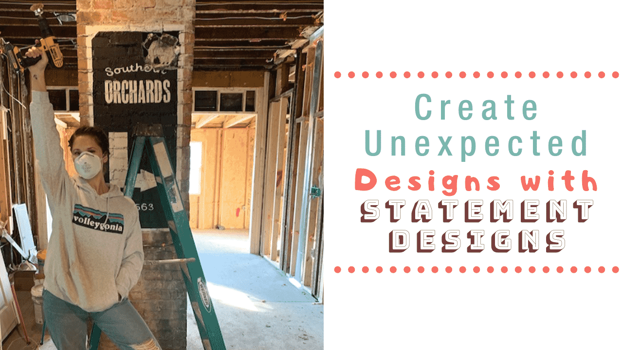
23 Nov Painting an ‘Old’ Ad on an Old Brick Chimney
This month I have been talking all about statement design! Today I am sharing ways to create unexpected designs with statement designs! Adding something unexpected to a space can breathe new life into a room and create conversation with guests.
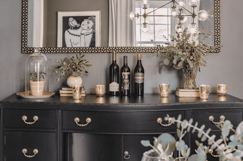
Last week, Lindsey and Chris shared 4 Ways to Add the Element of Surprise to Your Design and they nailed it! They shared the new artwork piece they just added to their newly transformed dining room (can you see it in the mirror below?)! Artwork is one of three ways they suggested to add an element of surprise that has a major impact… be sure to check out their post to see the rest!
If you are new to the blog, welcome to the House to Home link-up party! The House to Home Haven crew includes: Danielle and Michael from Clark + Aldine, Lindsey and Chris from Building Bluebird, Morgan and Jamie from Construction 2 Style and Katelynn and Uriah from The Inspiring Investment. Each month we focus on one topic (this month being statement design) and bring you fresh new content each week.

To get in on the action, all you have to do is drop your link to any blog posts, photos, or videos at the end for this post. Then everyone who stops by can see all the things you do too!
Here are the Party House to Home Haven Rules:
- Link to a relevant topic
- Link to a specific post, not a homepage
- Share the love!
Don’t forget to tag #housetohomehaven on Instagram for a chance to be one of the weekly winners and featured by the crew!
BETSY’S OLD BRICK CHIMNEY…
You know those old faded ads you see on brick buildings whenever you’re driving or walking around a downtown area?
I love them.
They speak to that area’s history. People get kinda up in arms over painting brick, but those old faded ads have always inspired me to do something like that in an interior space. And #betsy614 was the perfect opportunity for me to do it!
Related: Make Your Airbnb Instagrammable.
The Blank Slate
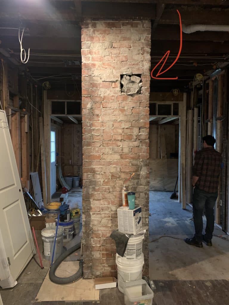
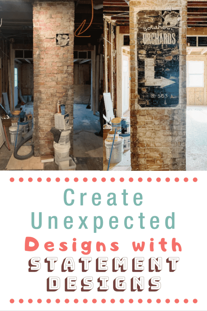
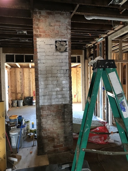
This chimney stack runs through the living room at our flip, #betsy614. It really wasn’t in the budget to knock it down. But where it stood…it was smack dab in the middle of our open floor plan not serving much of a purpose. Which annoyed me. ?
BRINGING IN THE TALENT
I often have a TON of creative ideas…it’s just executing them that I’m not the best at. I’m not really that artistic and I’m great at starting stuff and then not finishing it.
My best friend, Erin, is a wonderfully talented artist. She’s so good. She had also yet to visit me in my new home here in Columbus, Ohio. Mostly because she’s a Michigan fan and Columbus is like…the worst place in the world to her…but I knew that if I promised her a weekend full of art, cocktails, and merriment she could be swayed.
I was right.
We pulled together some concept boards like this:
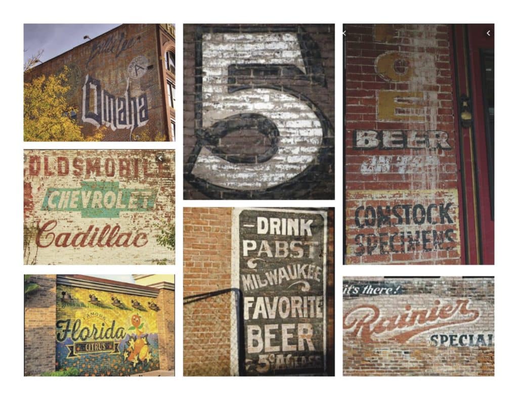
We knew we wanted to keep it simple since this was the first time we were doing anything like this. We also had the brilliant idea of, no matter what design we came up with, we would use a projector like I did for my Vintage Ohio Airbnb bedroom wall mural to help us draw out the lettering.
This is what we created to project on the wall:

We obviously added to it and tweaked it a bit -but this helped us bring it to life!
…well, that and Erin’s amazing talents.
Related: 11 Proven Tips for How to Renovate as a Couple (so you don’t kill each other).
Supplies
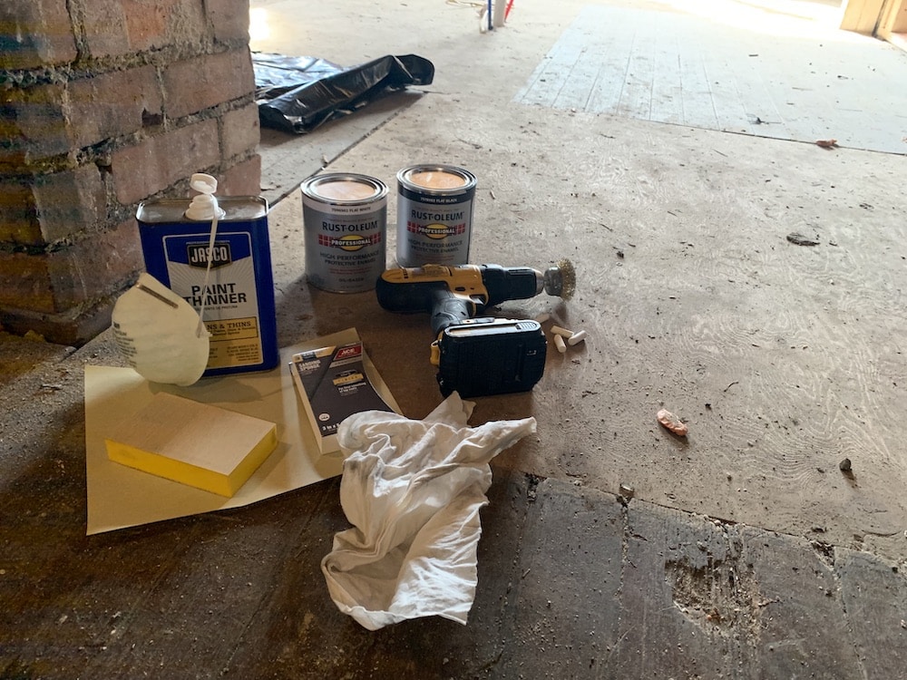
Because we had never done this before we weren’t sure what was going to work -mostly to make the ad look old. But this is what we ended up using:
- Oil-based paint
- Paint thinner
- sandpaper (all different grits)
- plenty of rags
- dust mask
- drill
- metal brush drill attachment
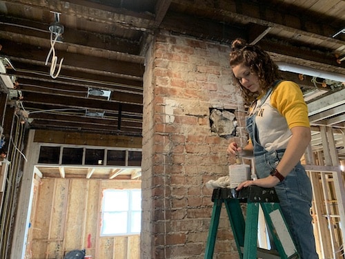
Paint Your Foundation
Ok, we decided to paint a white rectangle first. That way, Erin could trace out the words and then could paint black around them.
Transfer the Design
Erin was ready to trace out the words on the sign:
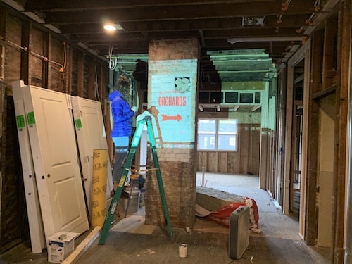
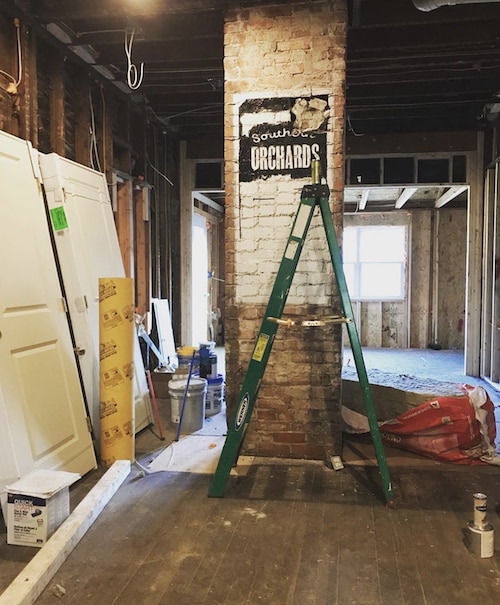
I am so glad my friends are talented. ?
Speeding Up 50+ Years
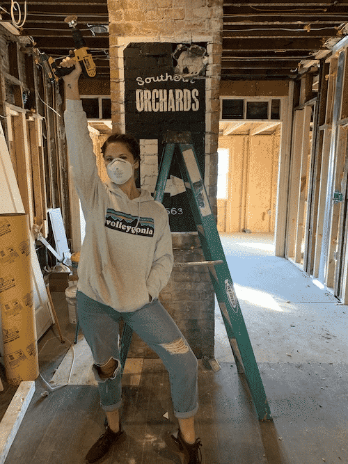
And there it is! All painted and pretty.
And while I loved the way it turned out -it didn’t quite yet have that weathered charm I was looking for.
We weren’t sure what would work to age the artwork:
- going at it with a drill with a metal brush attachment?
- sandpaper it?
- or maybe gently wipe it with paint thinner??
In the end? It all kind of worked together. First, we took the drill to it. We had to be careful because too much pressure and the brush left behind brush marks -which didn’t help it look authentic.
But with light pressure it did a good job of getting back down to the brick -which we liked!
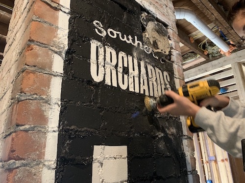
Once we felt we did enough with the drill we tried the sandpaper.
It worked ok but was definitely taking forever.
And then…the paint thinner.
A combination of the rough removal of paint by the metal brush and then the gradual fading with the paint thinner made this creation finally come to life! ?
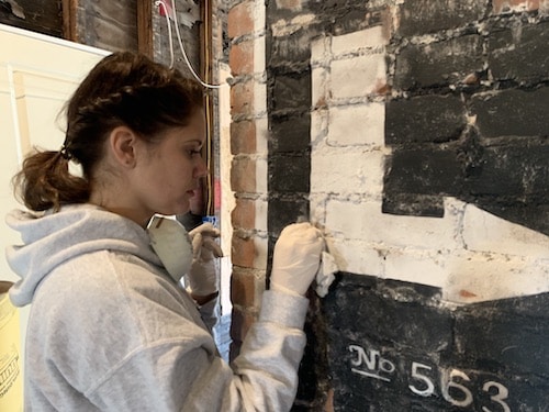
A combination of the rough removal of paint by the metal brush and then the gradual fading with the paint thinner made this creation finally come to life! ?
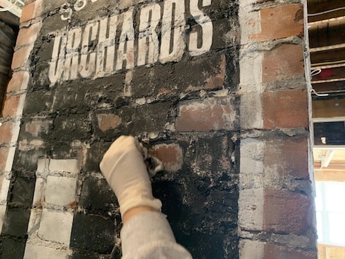
So good, right?!
Statement Art
Erin and I felt so good about the way it turned out! I cannot wait to get the drywall up and all the “new” stuff installed -then this old ad will really stand out!
Related: 5 Inexpensive Staging Tips to Update a 90’s Home.
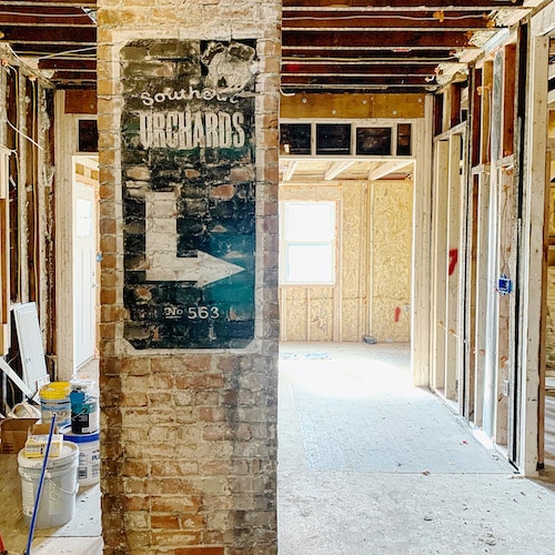
I have a feeling this won’t be my last ‘old brick ad’ project!
What do you think?!
Need help making a project or idea come to life? Contact Nestrs for a consultation or to hire professional design services.

No Comments