04 Jan How To Refresh Your Kitchen Without A Renovation and On a Budget!
This post is sponsored by Lowes Home Improvement. But all creative input, opinions, and thoughts are our own! Thank you for supporting our online corner of the world!

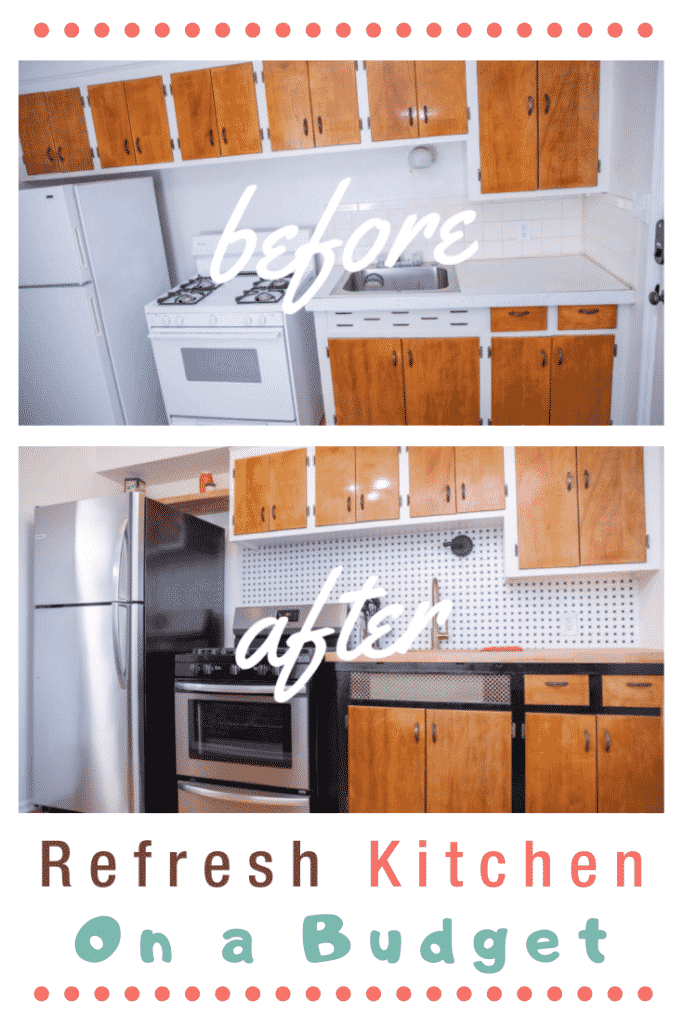
Refreshing your kitchen can be more than adding new towels or changing out cabinet hardware but much less than ripping out flooring and cabinetry.
Refreshing your kitchen doesn’t have to take 1-3 months and it doesn’t have to cost an arm and a leg.
What Brought on Our Refresh
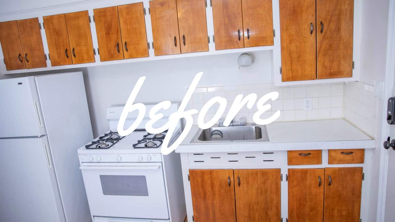
The appliances in one of our Airbnbs were slowing dying -the oven actually stopped working completely a few weeks ago. We knew we needed to do something about this kitchen but, money and time are tight right now and I know you can relate!
Since time was tight, I needed to figure out a way to “redesign” the kitchen with quick updates that I could purchase in-stock and that wouldn’t break our bank. So, we headed to Lowes.com to shop.
Let’s Get Real
We’ve pinched ourselves a few times over the past 6-months because we’ve gotten to partner with Lowe’s on a few ‘how-to DIY’ projects. Check out:
How To Use a Paint Sprayer Indoors
How To Install a Vanity and Faucet
How To Finish Drywall for Beginners
How To Hang Drywall for Beginners
How To Organizing Your Garage Like a Pro
How To Choose and Install Lighting For Your Home
It’s amazing to be able to work alongside a company that we depend on literally every single day to get our projects done.
We need a place that’s open early and late, has quality items in-stock, and all at affordable prices. We wouldn’t be able to do what we do for our clients, our Airbnb properties, or our renovation projects without a place like Lowe’s.
If time and money are concerns for you -know that shopping at Lowes.com is easy. You can select to only see items that are in-stock so you can keep your timeline on track! And if it’s not in stock at your closest location the website will let you know if it’s available at another location nearby!
Our Refresh Shopping List
- Fridge
- Gas Range
- Back Splash Upgrade ←we tried out peel and stick tiles for a quick, gorgeous, budget-friendly alternative!
- Deeper sink
- Faucet
- Countertop
- Task light over sink
- Ceiling light
- Decorative sheet metal to spruce up base cabinet
The pictures we’re including in our post are awesome -but check our 2-minute video out for a walk through of the space!
The Design
Fridge and Gas Range:
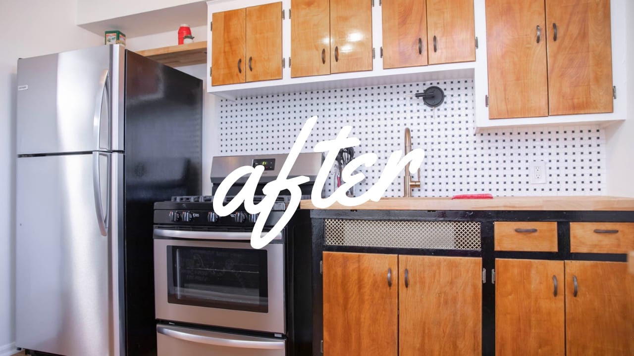
We knew we wanted stainless and that we wanted something spacious and dependable yet priced right. We’ve always been happy with the Frigidaire brand. This particular Frigidaire fridge model was priced right and boasted EasyCare Stainless Steel. Whether it’s going in a home with children or a high traffic Airbnb, keeping it clean and smudge free won’t be hard!
Also, make sure you triple check the space you have available for your new fridge. We knew we wanted to go taller than 50”. Our original cabinet layout wouldn’t allow for anything bigger so we removed the cabinet above the fridge space. Because we’re not getting too fancy here we used the scrapes from our countertop (more on that product below) to create a shelf space for cookbooks and some cute decor pieces above the fridge.
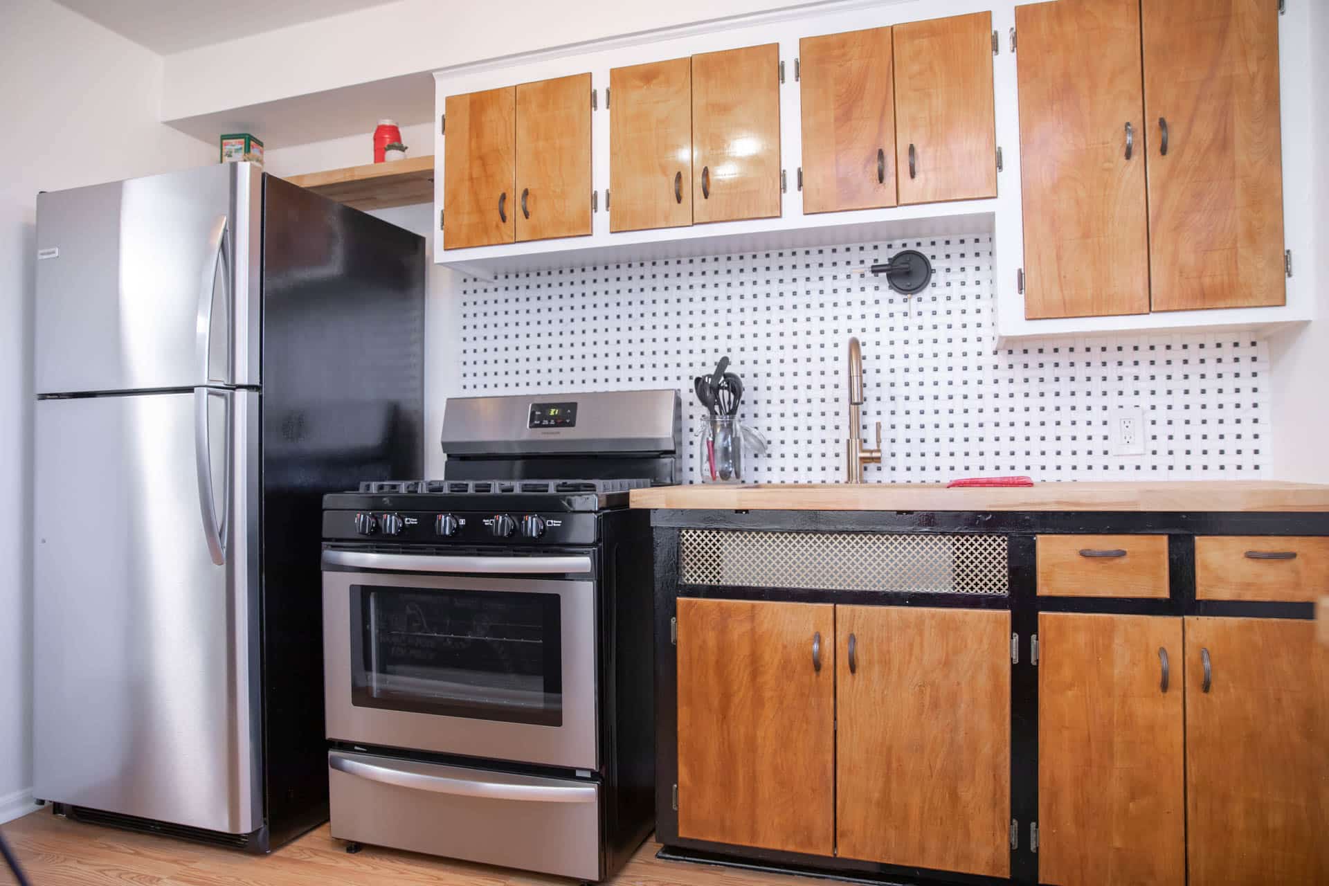
As for the Frigidaire 5-burner gas range we choose a model that has the EasyCare Stainless Steel so keeping it beautiful won’t be an issue. At under $500, the price couldn’t be beat for all the features this range offers. The burners all offer different levels of BTUs. If you’re wanting to boil water there is a17,000 BTU burner made for faster cooking. There is a 10,000 BTU oval burner for even griddle cooking. And, of course, a low simmer burner for more delicate foods. Love the broiler feature and the corner-to-corner grates on the stove top!
Tile:
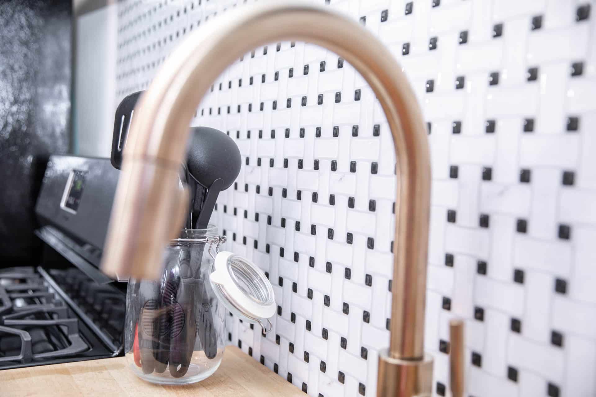
Like we said, our timeline was tight. We did this makeover in three days. There was no time to tile! Well, at least there was no time to remove the old tile, skim coat the wall, cut and apply actual tile onto the walls, wait for the mastic to dry, and then grout. Plus, we wanted to keep this refresh under $2,500. Instead we tried peel and stick tiles! Oh my goodness, this process was so easy! If you’ve got a steady enough hand, you only need a pair of scissors, a small level, and a straight edge! I’m not going to lie, my hand isn’t the steadiest so I may or may not have made a few of the finished edge cuts with our Dewalt Miter Saw. It worked perfectly. Just be sure to use protective eyewear!
Sink and Faucet:
In every budget friendly project I always splurge a little. In this case, we went for the gorgeous Champagne Bronze faucet by Delta. The color alone is gorgeous. Add on the pull down spray wand, the easy clean features, spray or stream options, and the magnetic doc, I know our guests are going to feel spoiled when they use the sink!
And, if you notice, the gold color from this faucet ties in with the decorative sheet metal feature in the base cabinet and with the gold and bronze ceiling light. Have fun with metals. You don’t always have to go all matchy matchy!
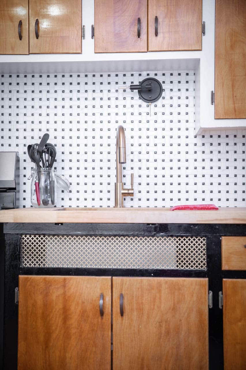
We had room to go super deep with the sink so we went for it. This single basin sink by Kraus came with a bunch of handy accessories like a bottom grid with plastic feet, a basket strainer, and even a cloth for cleaning. Although you don’t need those items, with all the good reviews, decent price point, and long-lasting features like a rust resistant finish we knew this sink would last us forever!
I’ll admit, it would have been easier to do a surface mount sink, but I love how sleek undermounts are.
Countertop:
We’ve never worked with butcher block countertops so this was the perfect opportunity to educate ourselves. Butcher block countertops come at a great price point and are easy to care for. If anything happens you can always sand them down and they’re like new again!
We didn’t have the proper equipment to cut out a finished space for our undermount sink, so we enlisted the help of our carpenter to create the space for our sink and to finish the edges. This cost us $150 and was well worth it!
Make sure you seal and protect your butcher block countertops with a product that actually penetrates the wood. Polyurethane will just sit on top of the countertop and could become brittle over time while a proper sealer would penetrate and protect the wood against water and stains.
Lighting:
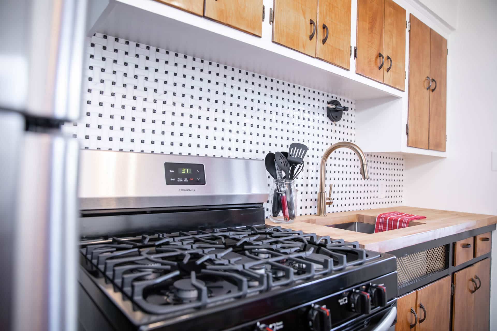
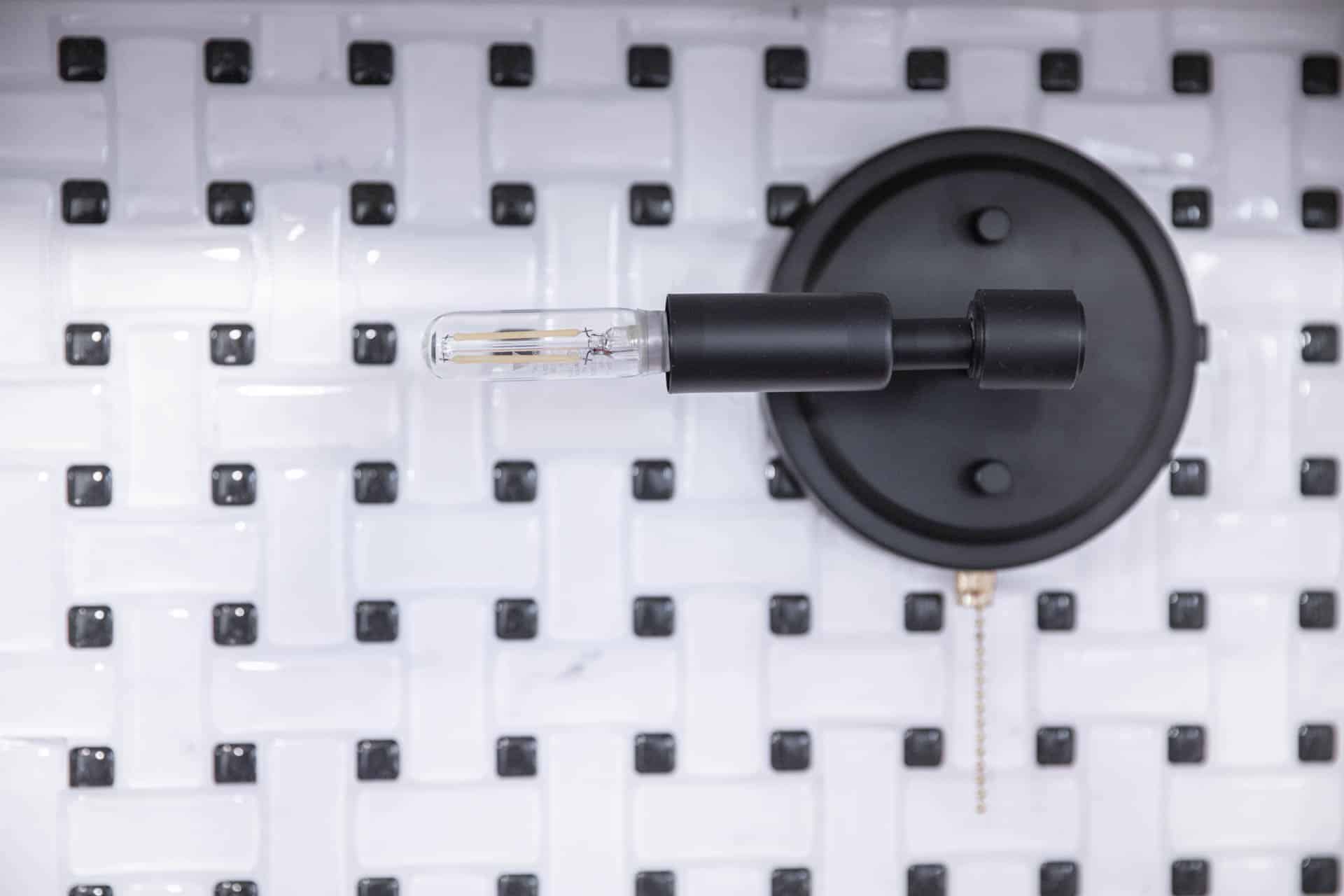
The light fixture that was orginally over the sink was off center. Since we didn’t want to have to mess with eletrical and move around the electrical box or nix it all together I found this light by Cascadia. Instead of mounting it upright I turned it to the left. This eased my OCD brain because now the light bulb was directly over the sink.
We also needed to make this light work with a pull chain since there was no switch attached to the original light. This is easy to do! We just grabbed this pull chain from Lowe’s, installed it as instructed, and created a space for the pull chain to live by drilling a hole on the side.
As for the ceiling light, I found this semi-flush mount by Quoizel that tied in our bronze and gold accents perfectly! It meets my requirements of being LED compatible, dimmable, and having at least three bulbs.
Final Touches:
Last, but not least the final touches. Let’s start with painting. We saved money here as we just pulled paint from our stash. We repainted all the walls Alabaster in a matte finish with the HGTV by Sherwin Williams line available at Lowe’s. I don’t like sheens on walls unless they’re serving a design purpose. Today’s high quality paints are easy to keep clean.
I then started to give the cabinets a fresh coat of white paint. For this I used a semi-gloss paint in Pure White by HGTV Home by Sherwin Williams so the cabinets would pop a bit from the wall. But when I got to the base cabinet I was inspired to paint them black. We have a black coffee cart on the other side of the kitchen and our appliances are stainless steel and black. I had some oil based black paint left over from another project and decided to go for it.
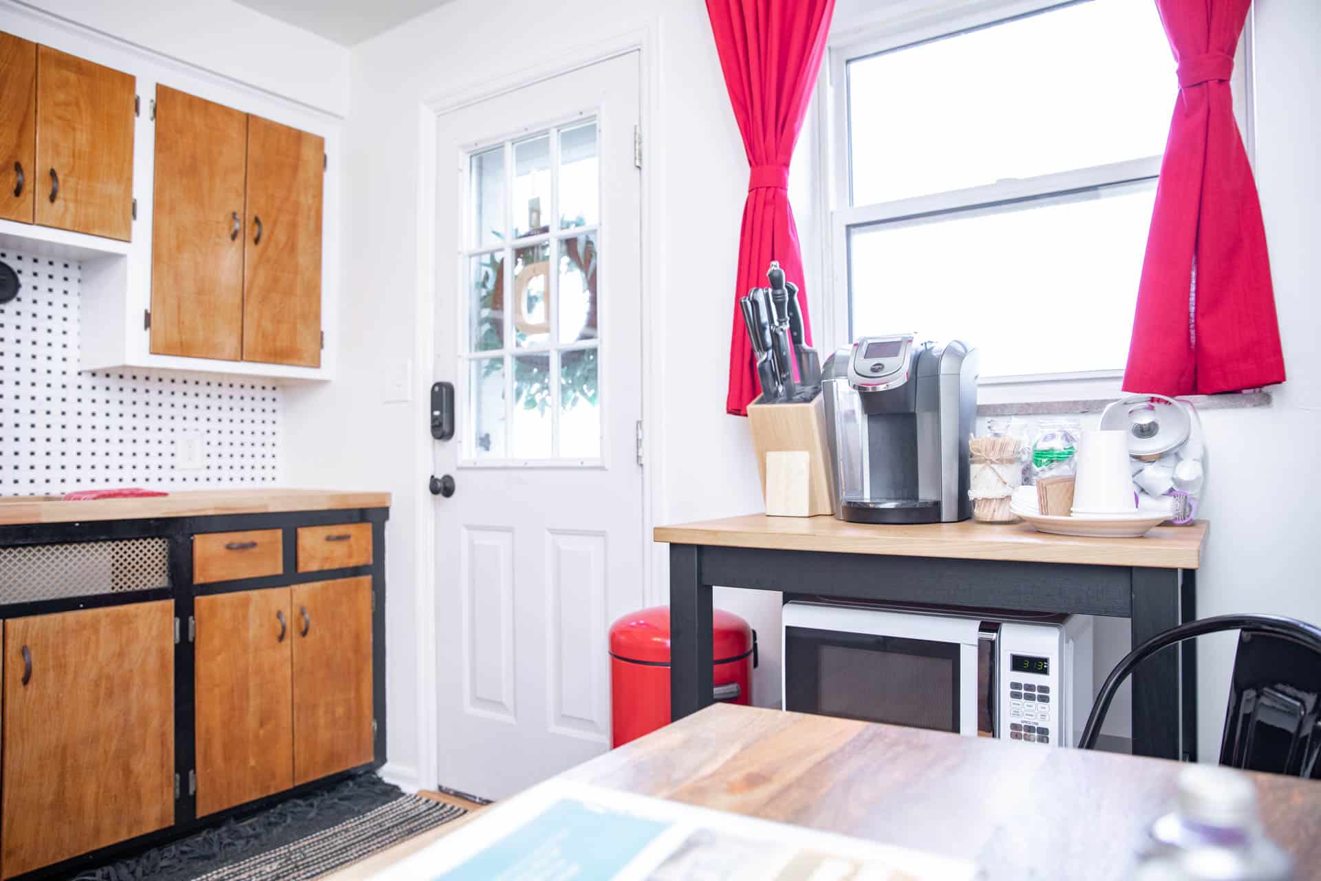
Here’s the thing -I couldn’t decide if I wanted to paint the cabinet doors. I wasn’t mad at how it looked (and how I ultimately kept things) leaving the doors as they were. Plus, I saved myself a lot of time. I love how the kitchen came out but I’m still about 50/50 on whether or not I should have painted the cabinet doors to match the rest of the cabinet. Feel free to weigh in below!
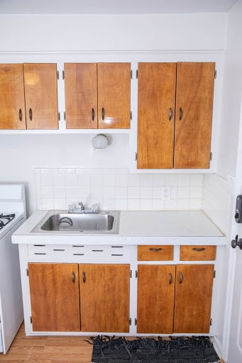
Last but not least, the decorative sheet metal. Check out the cabinet base before:
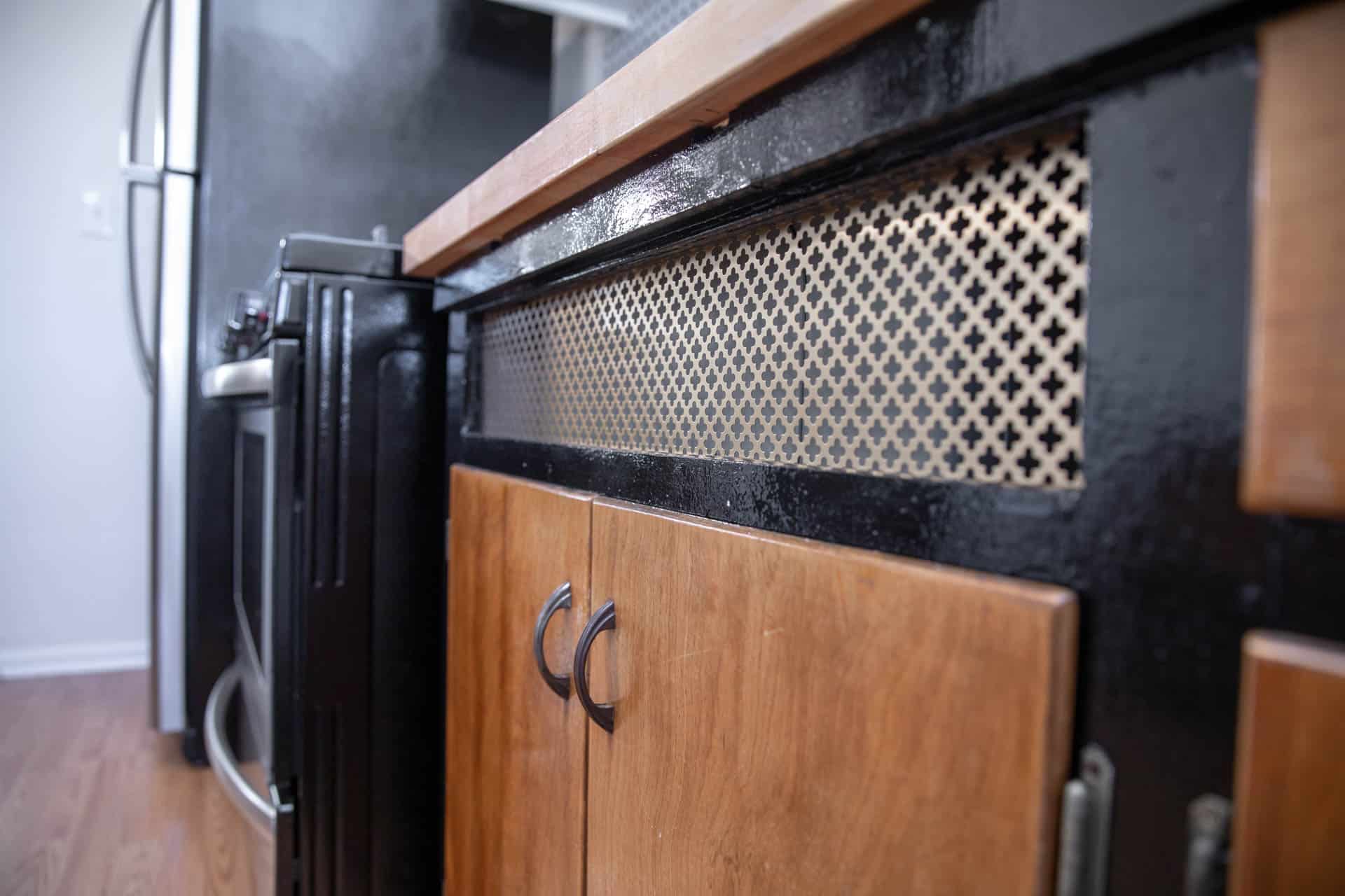
And then the space under the sink with the decorative sheet metal by Hillman:

I was pretty pumped with how it came out.
Drum Roll Please
For two new brand name appliances, a fabulous deep sink, gorgeous faucet, new lighting, and a few extra touches this kitchen refresh came in at $2,430.21.
I still can’t get over how awesome the backsplash looks.
Or that decorative metal.
Ok, I’m pretty pleased with this refresh -can you tell?!
Thanks for stopping by! As always, if you have any questions, let us know below or by sending us an email at welcomehome@nestrs.com .
Happy nesting!

No Comments