09 Nov 9 Decorating Trends to Throw Out

Let’s talk about the things you shouldn’t do when decorating a room. Here are a few trends to think twice about the next time you go to make a significant change in your space (or update what you’ve already got going on < we’ll talk about this at the very end!) Some of the trends we call out here are a bit more sinful than others (we’re looking at you, wallpaper borders), while others may be a matter of personal preference. Keep in mind this article comes with a big fat disclaimer: style is truly individual, so whatever you decide to do, that’s the right choice for you!
Related: How to Make Your Room Look Cool and More Expensive
1. Themed Rooms
Rooms that are built around a theme can be super fun to put together. However, they tend to lose their appeal really quickly. These designs become old and outdated so fast that the effort often becomes a big waste of time (not just the time you spent putting the thing together, but also the additional time you’ll end up spending on an effort to redecorate). If you have a particular passion or interest you’d like to incorporate into your space, consider adding the theme elements into a normal room.
2. Fast Furniture
Have you ever heard of the term “fast furniture”? It’s a label for anything that has been factory-made and is often of poor quality. These pieces are usually “some assembly required” and come at bargain prices. While fast furniture provides an opportunity to save money, the pieces just don’t last. You can get more for your dollars by opting to buy second-hand and repurpose solid, old furniture. These reclaimed pieces will bring a unique story to your space and won’t need to be tossed after a year or so of use. (The environment will thank you!)
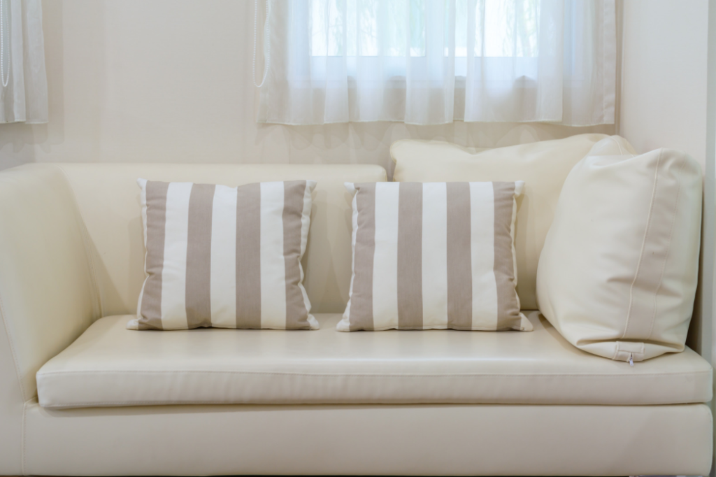
3. Formal Pillow Configurations
Accent pillows are having a moment right now. And we love it! However, we see so many of our clients fall into the trap of going overboard with accent pillows. If your pillows are getting in the way of using your couch, chair, or bed – you may have gone overboard, too. The pillow configurations you see in store windows or magazines aren’t necessarily practical for everyday living. Don’t abandon function for style!
Are you looking for more tips and insights on how to upgrade your home check out our blogs
4. Wallpaper Borders
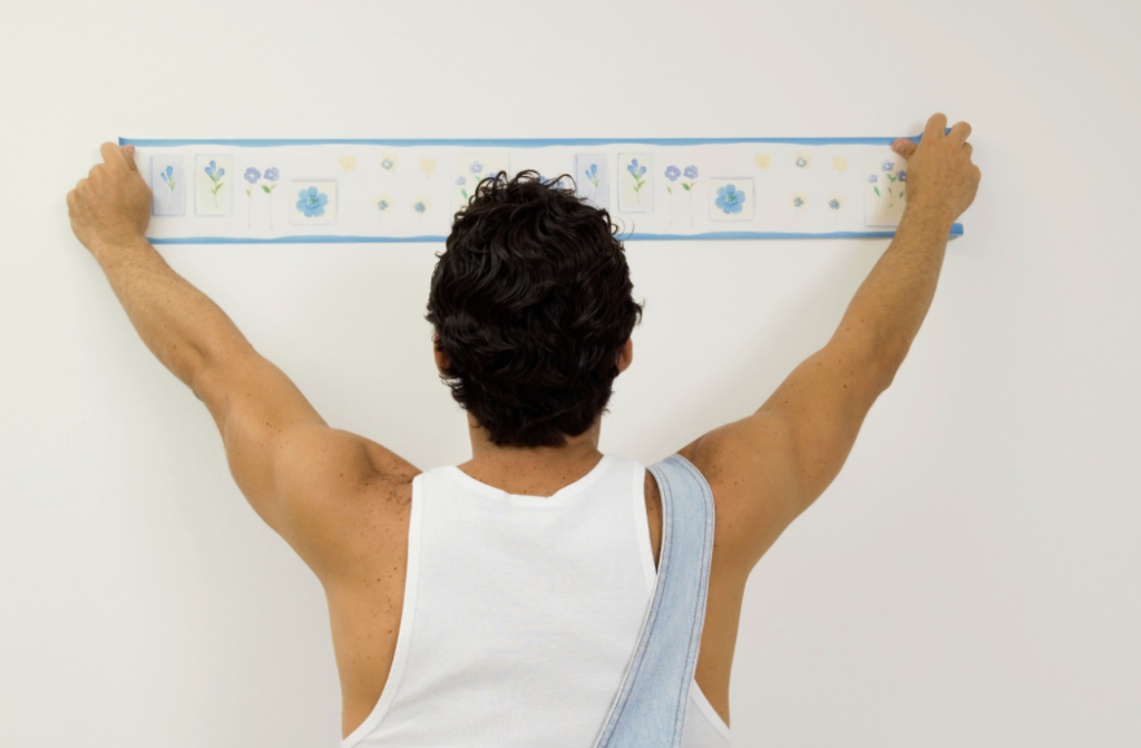
As a nineties kid, I know this style all too well. Wallpaper borders have run their course. Whether the design is coursing through the middle of the room or just trimming the top of the wall, getting rid of this element can be a major upgrade for your space. We have seen some surprising uses of wallpaper borders with designs updated for this century (Tempaper has a few lovely options in this style). If you’re feeling inspired to go this direction, consider a wallpaper product that will be easy to remove down the road.
5. Terrazo
Terrazo is a composite material that incorporates other materials like marble, quartz, granite, or glass to create flecks within the surface. This style makes its way into floor coverings and countertops quite a bit, and we’re just not loving it. The look is super specific, and you may fall out of love with it sooner rather than later! That’s not great when the floors and countertops aren’t cheap!
6. Edison Bulbs
If you’ve been to a coffee shop lately, chances are you’ve seen an Edison bulb hanging out, doing its thing. Edison bulbs have an antique style (let’s hear it for Thomas Edison!) and are typically used in settings that are craving the “exposed lighting” vibe. While this feel does suit some spaces, the harsh lighting it creates can be a bad move. We recommend springing for a statement lighting piece instead of a dinky exposed bulb.
Related: HOME PERSONALIZATION TIPS: HOW TO MAKE A PICTURE WALL
7. Overwhelming Pattern Use
We know it can be hard to fight the urge to use the same pattern repeatedly. We see this happen when people are afraid to mix and match or aren’t quite sure what patterns will be complimentary when used together. However, this matchy-matchy vibe is just no good. You can avoid this trap by varying the textures in your room (think draperies, rugs, and upholsteries) and mixing patterns with different styles (geometrical with floral, for example).
8. All White Rooms
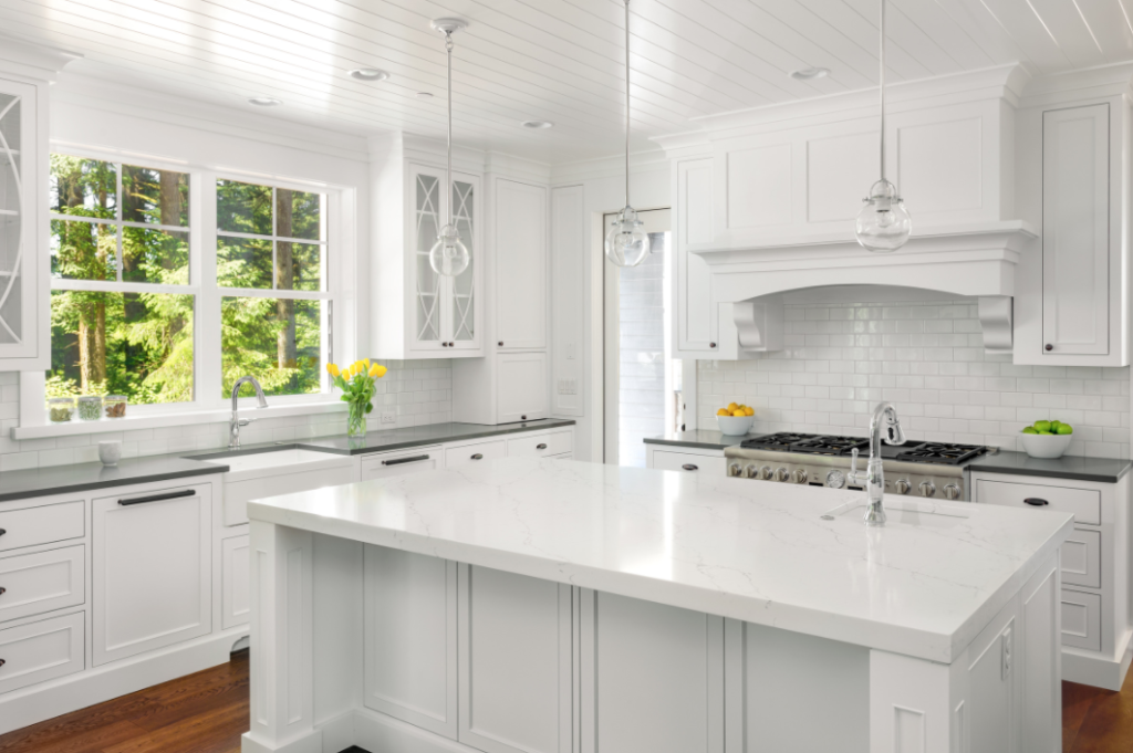
All white spaces, especially in the kitchen, can work for you if you want to create an ultra-modern look. However, if you don’t want to commit to something so extreme, make sure to pull in other colors or stain finishes to help soften your space. All white spaces can look really sparse, so adding a hint of color or texture will go a long way to create some much-needed dimension. In the kitchen, you can achieve this by adding a pop of color to the cabinetry.
9. Barn Doors (instead, get creative and make a door style that speaks to you)
Alright, this one pains me a bit to add to the list because we’ve definitely rocked a barn door in a few of our spaces. But hear me out! Barn doors have been REALLY trendy. That doesn’t mean you have to jump on board. They just don’t work for every set-up, and you shouldn’t spring for the style if you don’t really love it. Get creative; do some research. There are many really cool door styles out there, and we recommend that you take the time to find one that speaks to you.
How to Freshen Up a Dated Look
A common theme across the styles we outlined above is that they are simply dated. Freshening up a dated look can be really rewarding! Consider these tips below to get started on your mission.
Related: HOW TO MAKE YOUR ROOM LOOK COOL AND MORE EXPENSIVE
Find Your Own Style
Now is the time to do some deep thinking about your personal interior style. You’ve got to nail this down to create a space you can love for seasons to come. (Doing anything less will cost you a lot of money and time, in the long run!) A few questions can help you get started:
- What defines your personal taste?
- What colors do you love and why?
Look for inspiration everywhere! On a greeting card, in a magazine, or a print on a shirt you love! Pull out different elements from items all around you and see if there is a cohesive theme that might give you more insight! Once you’ve honed in on these basic style fundamentals, you can build upon them as you move forward.
Keep Wall Paint Fresh
Even if you don’t plan to change your walls’ color, giving them a fresh coat of paint will instantly update your space’s feel. The new coat of paint doesn’t necessarily need to be white – fresh alone will do! Putting up a new coat of paint is the easiest and most cost-effective way to freshen up a dated look.
Related: Home Design themes.
Layer, But Not Too Much
Layers are a really powerful design tool. They add diversity into space and help to keep the eye moving. But be careful! It’s easy to get carried away with layering, especially when it comes to pillows and throws. Take a step back every once in a while and do some editing to be sure your design hasn’t become too cluttered.
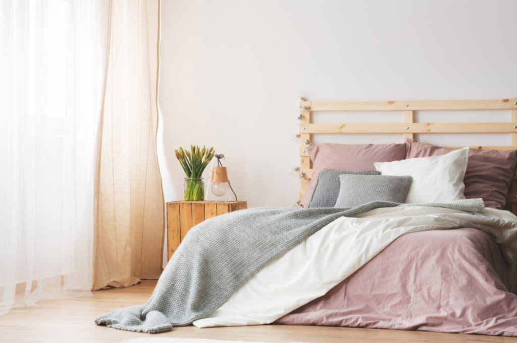
Have a Flexible Color as Your Base
We recommend that you choose a base color for your room’s palette that will still look great as you make small changes in the space over time. Once you feel locked into a preference, try to carry this base color theme throughout your room (and home, if possible) to protect against an outdated design as trends change.
Fund Future Changes
Here’s a bit of forward-looking advice: begin to set-aside funds that you can use to make changes as time moves on. Interior trends will change, and your preferences are likely to shift, as well. Having this savings account dedicated decor will come in real handy. This account is perfect for when you feel compelled to redecorate.
Still have questions? Check our blog page for more resources!
Conclusion
I know we’ve made a few black-and-white claims above. But here’s the deal: if you’re the one living in the space, making yourself happy never goes out of style. Our last piece of advice? Press on with something that you know you’ll absolutely enjoy, even if it’s on a list of outdated design trends to avoid. You do you! If you’re renovating a space to sell or rent (either short- or long-term), it’s more important to keep other people’s tastes in mind, though!

No Comments