06 Jul Home Personalization Tips: How to Make a Picture Wall
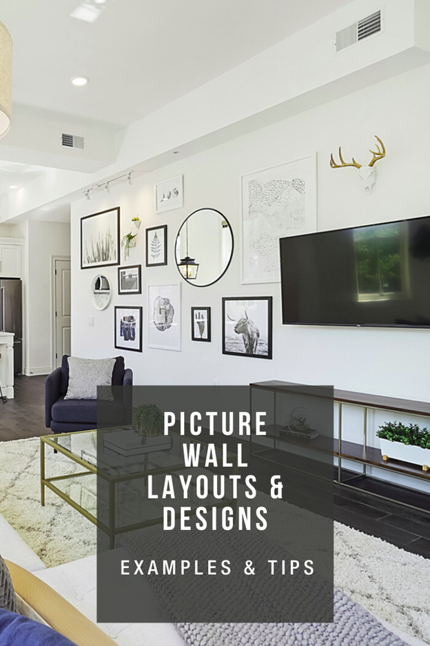
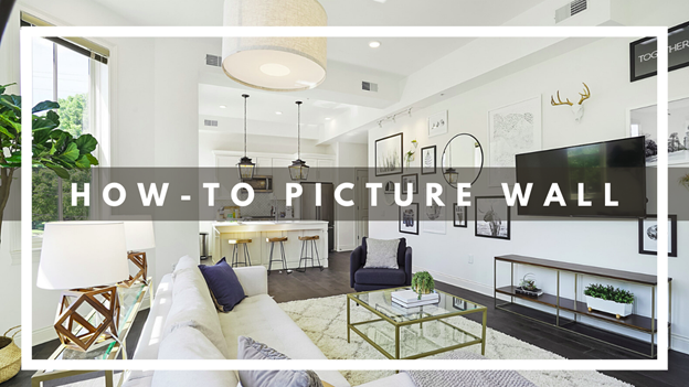
Creating a picture wall in your home is a great, simple way to bring a little character to your home. Even though we take about a million pictures a day with our phones, we hardly ever get them printed and even fewer get hung!
I’m totally guilty of this, but my current excuse is that we move every 6 months to a year —what is my life?! 🙂
Now if you don’t want to just have a gloried wall of pictures of yourself, you can look at it more like a Pinterest mood board. It can be a collective group of photos, patterns, and such that lend to the feel of your home and who you are.
Check us nestrs out!
How to Make a Picture Wall
Picture walls can take some coordination on multiple levels. Everything from finding the right photos, getting them from family, and figuring out where you’re going to get them printed. I wouldn’t rush this project. The larger the wall and number of photos, the longer it may take to find an arrangement that works for your space.
Oooor, you can opt to purchase images. Some of my favorite websites to do this are Etsy.com and Society6.com!
Related: Modern Designs
Find a Good Spot
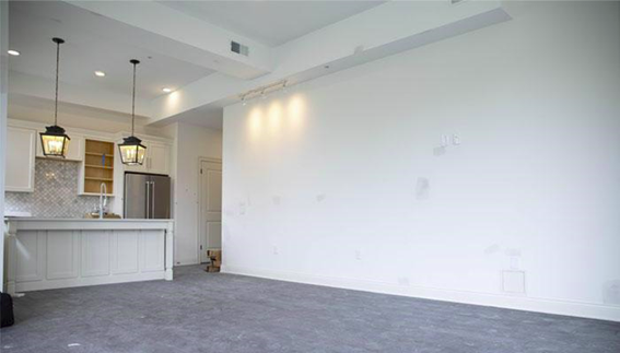
Finding a good wall in your home is key. Clutter is one thing that quickly shrinks a room and creates a subtle amount of mental chaos when you look at it. We don’t want this wall to be too small or we won’t have enough room to work. If you’re afraid that the wall is too small, then take a quick tour through some of the photos you are thinking about hanging and roughly judge how large you would like to see some of them. Once you have some ‘pillar’ pictures we can begin to make a good judgment call on the space needed.
Use Painter’s Tape to Outline Your Picture Frame
If you already have some picture frames then great! If not, you will need to jump online and take a look at a few that fit your style. Be sure to bookmark these as we will need some additional details from them. Don’t jump the gun and order them just yet! Right now we want to work with what we have.
My conversion from mental picture to reality isn’t always to scale, so the easy hack is measuring the size of your picture frames and using painter’s tape to create an easily moveable frame. If you are working from a pattern or hanging style you’ve found online, then it may be a good idea to adhere the painter’s tape to printer paper —or you can use gift wrap paper for larger scale pieces. This will allow you to easily move all the frames around without having to re-tape the frames again and again.
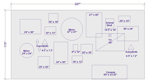
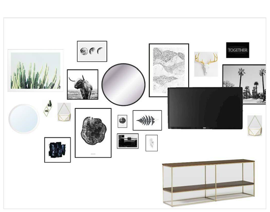
Now, if you are doing this for a client or for another space that you don’t have access to at your leisure, you can take another approach and digitally render the measurements to scale. Here is a picture of just that, that I did for a client. Take a look at some projects we’ve completed for clients.
Design and Order Your Picture Frames
I’ve included a picture of my digital wall and arrangement of photos. As you can see there aren’t any photos of the client, which is totally ok! Picture walls just only have to have pictures, feel free to color outside the lines… I always like to 😉 Be bold in your choices! You may be thinking, “Can I add circular mirrors like that?” Absolutely, mix and match. The goal is for the wall as a whole to be balanced and cohesive when viewed as a whole.
Hang The Picture Frames
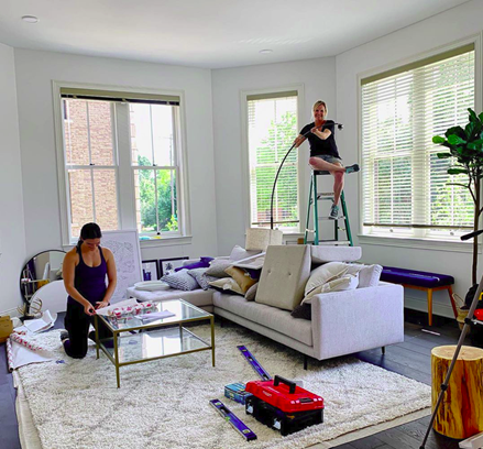
There is nothing too complicated about this process until you start it. Even though I start every project with a plan, the end result is never a 100% replica of my initial design. Adapt as you see fit.
A few tips!
In my world a laser level is life! You will need a taller ladder in order to place it square on the wall, while you still have enough room to work. I would still recommend checking each frame with a small level, but the laser helps keep large designs from slanting.
Choosing your wall adhesive. I used a few different types of mediums to hang the various decor, ie: Drywall anchors, command strips, and the simple classic gold nail. More than not I used the drywall anchors for heavy mirrors, command strips for most frames, and gold nails for anything that is hung from a string or strap.
Related: Some simple ways to freshen up your home!
Picture Hanging Trends
This can get overwhelming if you haven’t looked into this before. Besides all of the ones list below, you can use combinations of these as well. The goal is always to make your space unique with the arrangement and that of what is located in each frame.
Salon Style
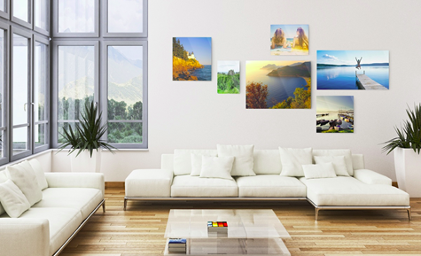
“Salon-Style” simply refers to a group of art, pictures, or media that is hung wider and higher than that of the traditional eye-level single row display.
The Statement Piece
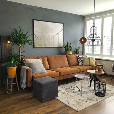
The Statement Piece refers to a single picture frame on a wall. This style is typically popular with large pieces of art and accented by being hung over a piece of furniture.
Hung in a Row
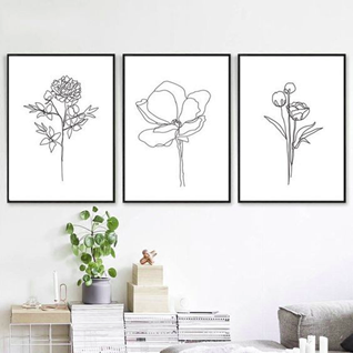
It sounds just like what it is! You hang 3 pictures in a row that are equal distant from each other. More often than not the frames for the pictures are the same size.
Inside the Lines
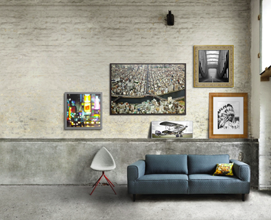
This style is achieved by creating a imaginary shape such as a rectangle, circle, or triangle, that your pictures are contained within.
The Picture Grid
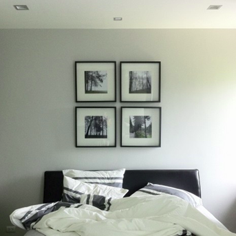
The picture grid is the expanded version of ‘hung in a row’ The typical configuration has 9 photos, equal distant from each other, hung in a square shape, with each frame being the same size.
If you are enjoying our tips so far and are interested in our help, feel free to contact us!
Picture Ledge
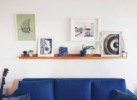
Having become very popular over the last few years, the picture ledge has a lot of exceptions. The one constant is that these photos are sat on a thin ledge shelf. There can be multiple on the same wall, photos overlapping each other, different sizes. It’s the wild west!
Symmetrical Display
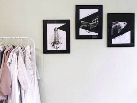
It consists of any design that you can think up that is Asymmetrical. More often than not the guiding light is to use the same size frames and distance from previous examples.
Split Image
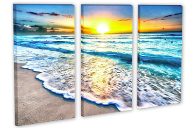
Split Image is one of my favorites if done with the right photo! Take a single image and splice it into multiple frames. The go-to is two or three frames, however, I have seen some abstract takes on this one.
Different Perspectives
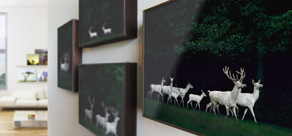
Different perspectives are more rare than most, as they are typically more expensive and custom. This is a grouping of photos that show the same subjects, in the same background, from different angles. It could be anything from deer, to family, to landscape.
Wall Collage
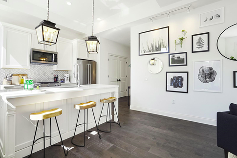
I would classify my example that I did for a client to be a wall collage. Mix and match pictures, frames, art, and colors. The collage style gives me the most freedom as a designer. It’s handy to add color and character to a space, while keeping extra decor off the floor.
Related: Learn how to make your walls POP!
Closing Thoughts
Picture walls can be such a great statement piece in a home, an additional to an already well designed home, and constantly changed. Once a design is set, it is much easier to gradually replace a picture at a time because you know exactly what you’re looking for, as opposed to multiple options. These wall designs can also be swapped out for seasonal photos or updated family photos as you get them. If you put the time and effort into the design and layout in the beginning, then it will be much easier to make small changes as you go!
You are always welcome to contact us, it will be a pleasure to assist you with your design.

No Comments